How interest in colleagues' work helped me successfully launch a new feature at VK Calls

*

*online video conferencing service

Years

2022-2023

Role

Product Designer

Platforms

Web, Mobile, Desktop

Result

From 0 to 4500 MAU

Platforms

Web, Mobile, Desktop

Result

From 0 to 4500 MAU

Platforms

Web, Mobile, Desktop

Result

From 0 to 4500 MAU

Imagine you're a product designer at VK,
a large Russian social network with 100 million MAU.

One day, a manager from another project desperately asks for your help. The nuance is that nobody can onboard you.

A challenge, huh? Are you gonna take it?

VK Calls

VK Video

VK ecosystem

What am I dealing with?

The project asking for help is VK Calls,
an online conferencing service

It’s a part of VK social network. The number of monthly active users is 20 million. It’s fast and completely free, but many users of VK were still not familiar with it.

The goal is to increase the group calls

Business wasn’t satisfied with VK Calls' performance and wanted to attract new users to boost group calls through online lessons.

Cross-functional team

Project managers, developers, analysts, UX researchers

Business:

wants to increase the number of audience
and group calls

Team:

thinks a new designer won’t understand product complicity

Users:

prefer other platforms, even ready to pay for subscription

Together with the UX researchers, we interviewed teachers. Why teachers? They conduct lessons online — it’s a great opportunity to raise VK Calls’ group calls.

Teachers

Want to split participants into smaller
groups for collaborative work

Students

Want to practice their new knowledge more during a lesson

Insight

Teachers
need a break!

a break!

Breakout rooms

A feature that will allow call administrators to split participants into small groups to practice

Brainstorming how should
Breakout rooms work

With our findings in hand, I organized a brainstorming session to prioritize the key functions for the first release.

We needed to concentrate on what’s was crucial to create a smooth experience for both administrators and participants, and at the same time make sure that all the features won’t cause difficulties during the development.

Creating user flows

How can we make the distribution of call participants fast and easy?

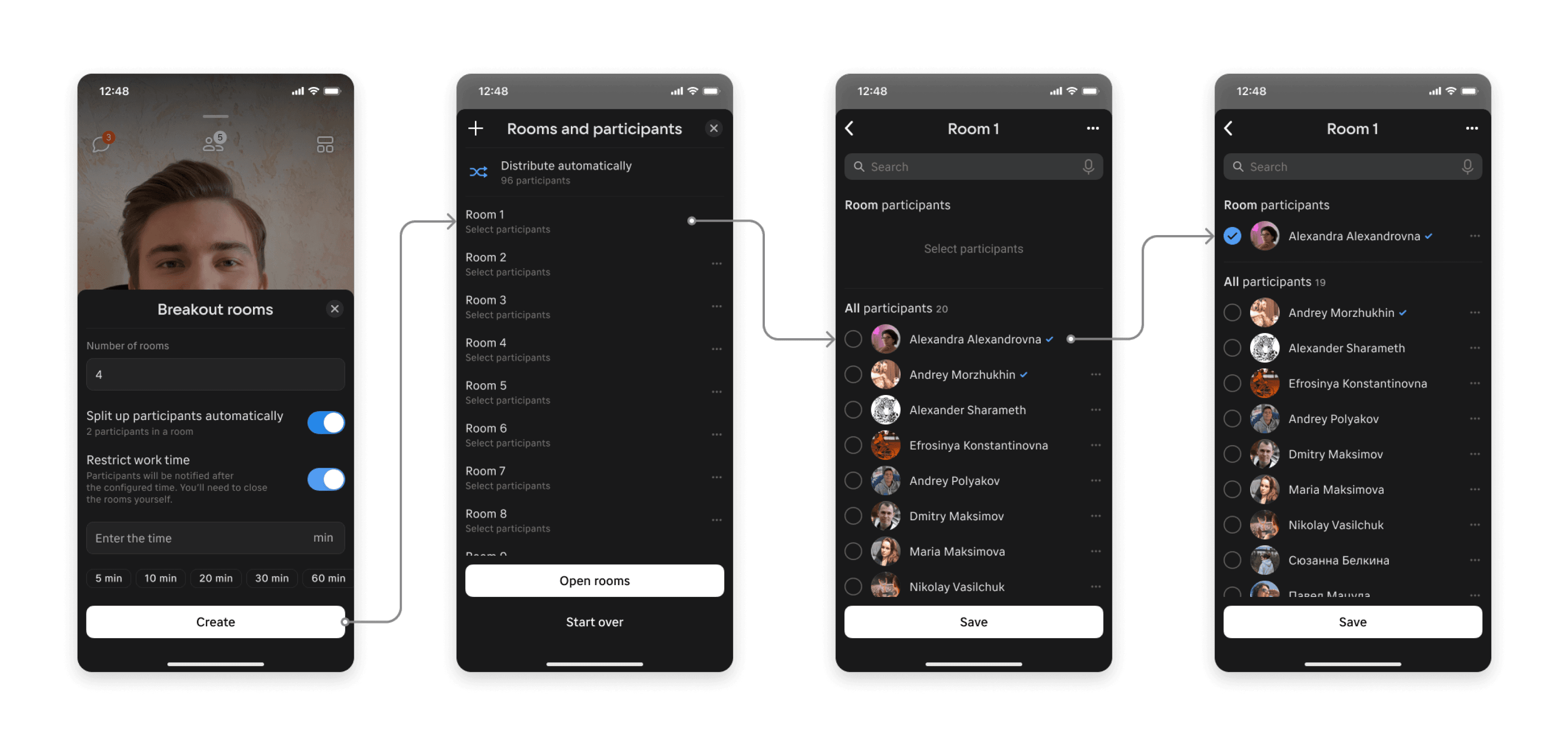
My first design concept aimed to be simple and user-friendly. However, user testing showed that it wasn’t.

1. Setting number of rooms

:

Easy and clear

Has auto distribution

Misses some extra settings

2. Rooms overview

:

Easy to understand

Too time-consuming

Getting tired of making all these clicks

3. Assigning participants

:

Simple user flow

Too many clicks

Two different interfaces for the same feature

Back to rooms overview

:

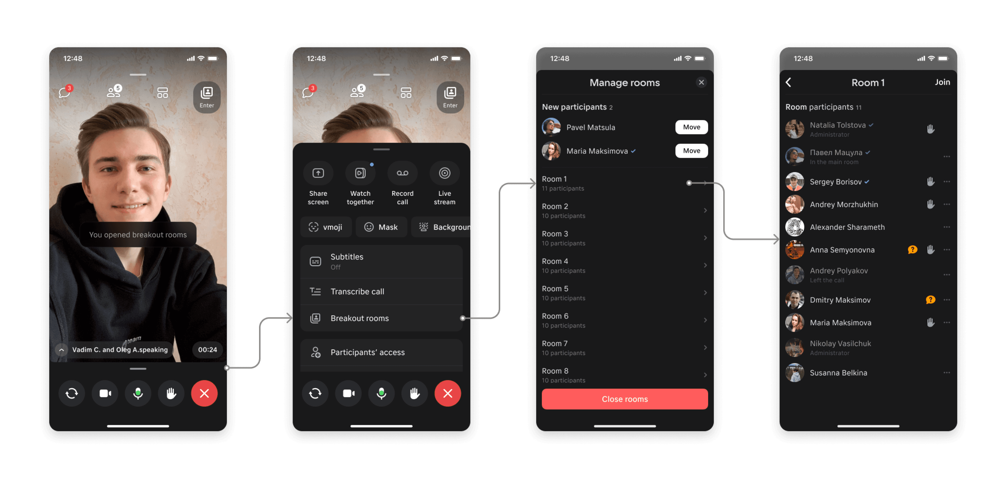
To open the rooms a user should
get back to the rooms overview

User tests helped to shape
a better version of the flow

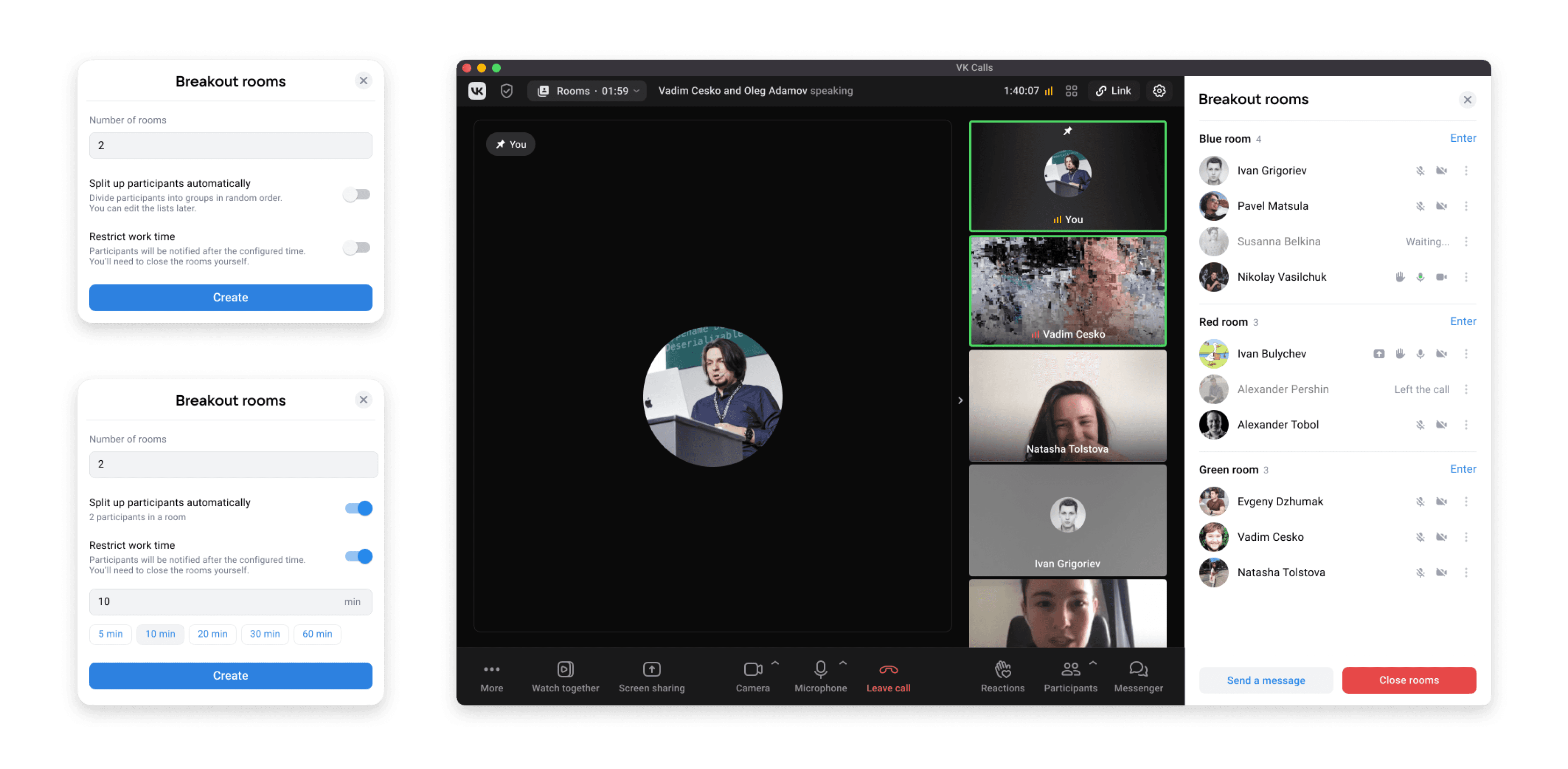
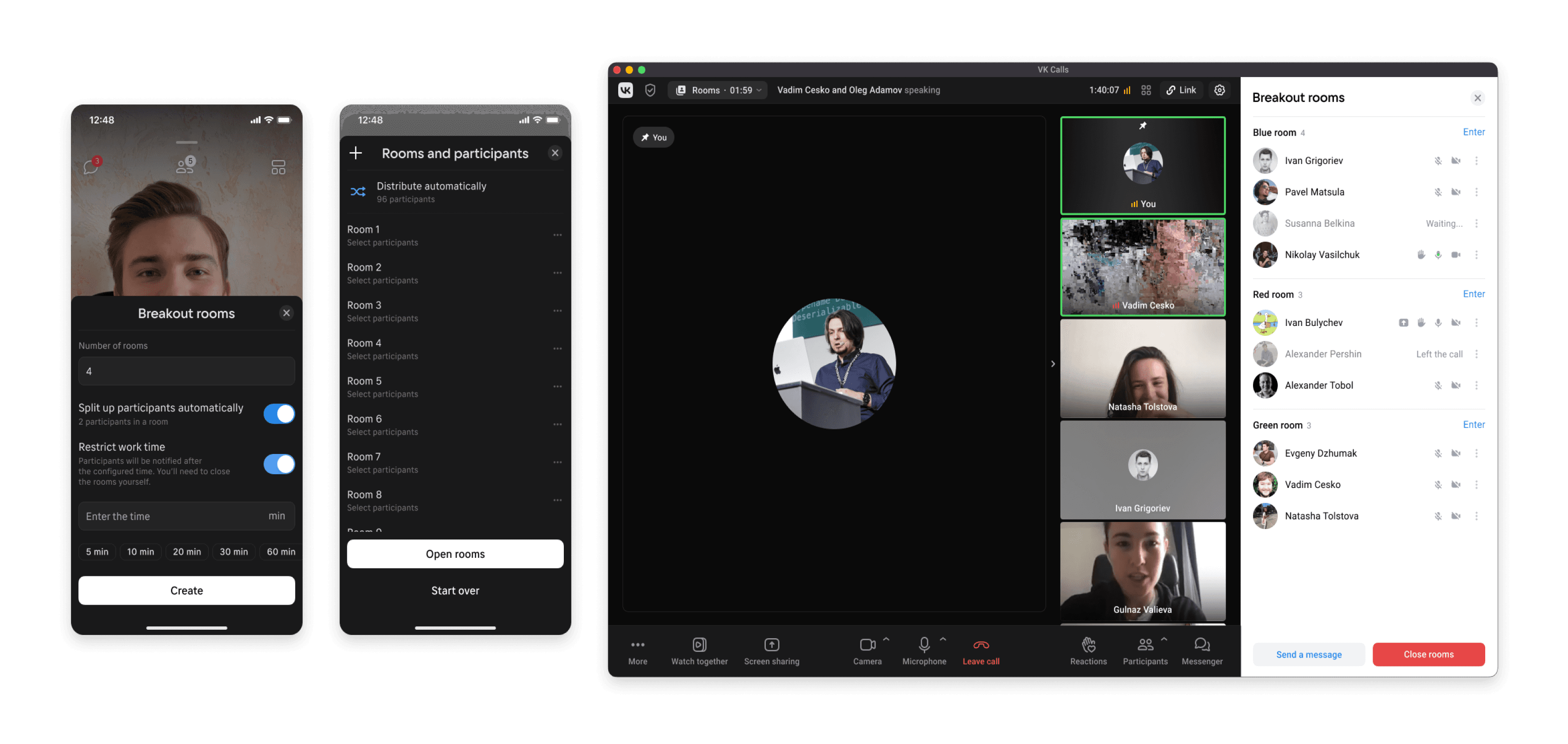
Determined to improve, I developed a new solution that allowed administrators to assign participants to multiple rooms in a single window. This was a game-changer, significantly reducing the number of clicks and saving valuable time.

1. Setting number of rooms

No changes

2. Rooms settings

:

Easy to understand

All settings in one place

Familiar logic

3. Assigning participants

:

Fast way to assign participants

Better and nicer than Zoom

The rooms can be opened any time

VK Calls team:

“We're concerned it will take time for you to get up to speed with the product”

Dealing with professional distrust is stressful.
What helped me?

By the time I joined the project, I already knew a lot about their technical constraints, failures and successes, team processes. And all these I got just by listening and paying attention to what my colleagues say.

Exploring projects

in Figma

Being interested
not only in visuals, but in reasons, process and results

Talking
to other
designers

on design reviews

Paying attention

Asking PM
about other projects

Painfully long implementation

The development process was divided into three phases, stretching
over several months due to resource constraints. I kept in constant touch with the development teams, conducting reviews and providing solutions for unexpected technical issues, and at the same time was working with my original VK Video team.

Aug

2022

2023

Sep

Oct

Nov

Dec

Jan

Feb

Mar

Apr

May

Jun

Jul

Aug

Sep

Administrators
mode on Web,
iOS, Android

Working with VK Calls team

Working with VK Video team

Desktop

Participants
mode on Web,
iOS, Android

Release

Results

Results

6

main user

scenarios

300

web & mobile screens

250

daily active users (DAU)

4500

monthly active users (MAU)

Key takeaways

Stay updated

It's important to stay in the loop with other teams at your company. It makes transitions smoother and allows you to reuse their successful solutions.
Validate solutions early

Testing various concepts from the start helps make informed decisions. User feedback is invaluable.

Some features take time

This project was a lesson in patience, iterative design, and adapting to new requirements and technical limitations.

Rooms overivew

Creating rooms

Managing rooms

How interest in colleagues' work helped me successfully launch a new feature at VK Calls

*

*online video conferencing service

Years

2022-2023

Role

Product Designer

Platforms

Web, Mobile, Desktop

Result

From 0 to 4500 MAU

Platforms

Web, Mobile, Desktop

Result

From 0 to 4500 MAU

Platforms

Web, Mobile, Desktop

Result

From 0 to 4500 MAU

Imagine you're a product designer at VK,
a large Russian social network with 100 million MAU.

One day, a manager from another project desperately asks for your help. The nuance is that nobody can onboard you.

A challenge, huh? Are you gonna take it?

VK Calls

VK Video

VK ecosystem

What am I dealing with?

The project asking for help is VK Calls,
an online conferencing service

It’s a part of VK social network. The number of monthly active users is 20 million. It’s fast and completely free, but many users of VK were still not familiar with it.

The goal is to increase the group calls

Business wasn’t satisfied with VK Calls' performance and wanted to attract new users to boost group calls through online lessons.

Cross-functional team

Project managers, developers, analysts, UX researchers

Business:

wants to increase the number of audience
and group calls

Team:

thinks a new designer won’t understand product complicity

Users:

prefer other platforms, even ready to pay for subscription

Together with the UX researchers, we interviewed teachers. Why teachers? They conduct lessons online — it’s a great opportunity to raise VK Calls’ group calls.

Teachers

Want to split participants into smaller
groups for collaborative work

Students

Want to practice their new knowledge more during a lesson

Insight

Teachers
need a break!

a break!

Breakout rooms

A feature that will allow call administrators to split participants into small groups to practice

Brainstorming how should
Breakout rooms work

With our findings in hand, I organized a brainstorming session to prioritize the key functions for the first release.

We needed to concentrate on what’s was crucial to create a smooth experience for both administrators and participants, and at the same time make sure that all the features won’t cause difficulties during the development.

Creating user flows

How can we make the distribution of call participants fast and easy?

My first design concept aimed to be simple and user-friendly. However, user testing showed that it wasn’t.

1. Setting number of rooms

:

Easy and clear

Has auto distribution

Misses some extra settings

2. Rooms overview

:

Easy to understand

Too time-consuming

Getting tired of making all these clicks

3. Assigning participants

:

Simple user flow

Too many clicks

Two different interfaces for the same feature

Back to rooms overview

:

To open the rooms a user should
get back to the rooms overview

User tests helped to shape
a better version of the flow

Determined to improve, I developed a new solution that allowed administrators to assign participants to multiple rooms in a single window. This was a game-changer, significantly reducing the number of clicks and saving valuable time.

1. Setting number of rooms

No changes

2. Rooms settings

:

Easy to understand

All settings in one place

Familiar logic

3. Assigning participants

:

Fast way to assign participants

Better and nicer than Zoom

The rooms can be opened any time

VK Calls team:

“We're concerned it will take time for you to get up to speed with the product”

Dealing with professional distrust is stressful.
What helped me?

By the time I joined the project, I already knew a lot about their technical constraints, failures and successes, team processes. And all these I got just by listening and paying attention to what my colleagues say.

Exploring projects

in Figma

Being interested
not only in visuals, but in reasons, process and results

Talking
to other
designers

on design reviews

Paying attention

Asking PM
about other projects

Painfully long implementation

The development process was divided into three phases, stretching
over several months due to resource constraints. I kept in constant touch with the development teams, conducting reviews and providing solutions for unexpected technical issues, and at the same time was working with my original VK Video team.

Aug

2022

2023

Sep

Oct

Nov

Dec

Jan

Feb

Mar

Apr

May

Jun

Jul

Aug

Sep

Administrators
mode on Web,
iOS, Android

Working with VK Calls team

Working with VK Video team

Desktop

Participants
mode on Web,
iOS, Android

Release

Results

Results

6

main user

scenarios

300

web & mobile screens

250

daily active users (DAU)

4500

monthly active users (MAU)

Key takeaways

Stay updated

It's important to stay in the loop with other teams at your company. It makes transitions smoother and allows you to reuse their successful solutions.

Validate solutions early

Testing various concepts from the start helps make informed decisions. User feedback is invaluable.

Some features take time

This project was a lesson in patience, iterative design, and adapting to new requirements and technical limitations.

Rooms overivew

Creating rooms

Managing rooms

How interest in colleagues' work helped me successfully launch a new feature at VK Calls

*

*online video conferencing service

Years

2022-2023

Role

Product Designer

Platforms

Web, Mobile, Desktop

Result

From 0 to 4500 MAU

Platforms

Web, Mobile, Desktop

Result

From 0 to 4500 MAU

Platforms

Web, Mobile, Desktop

Result

From 0 to 4500 MAU

Imagine you're a product designer at VK,
a large Russian social network with 100 million MAU.

One day, a manager from another project desperately asks for your help. The nuance is that nobody can onboard you.

A challenge, huh? Are you gonna take it?

VK Calls

VK Video

VK ecosystem

What am I dealing with?

The project asking for help is VK Calls,
an online conferencing service

It’s a part of VK social network. The number of monthly active users is 20 million. It’s fast and completely free, but many users of VK were still not familiar with it.

The goal is to increase the group calls

Business wasn’t satisfied with VK Calls' performance and wanted to attract new users to boost group calls through online lessons.

Cross-functional team

Project managers, developers, analysts, UX researchers

Business:

wants to increase the number of audience
and group calls

Team:

thinks a new designer won’t understand product complicity

Users:

prefer other platforms, even ready to pay for subscription

Together with the UX researchers, we interviewed teachers. Why teachers? They conduct lessons online — it’s a great opportunity to raise VK Calls’ group calls.

Teachers

Want to split participants into smaller
groups for collaborative work

Students

Want to practice their new knowledge more during a lesson

Insight

Teachers
need a break!

a break!

Breakout rooms

A feature that will allow call administrators to split participants into small groups to practice

Brainstorming how should
Breakout rooms work

With our findings in hand, I organized a brainstorming session to prioritize the key functions for the first release.

We needed to concentrate on what’s was crucial to create a smooth experience for both administrators and participants, and at the same time make sure that all the features won’t cause difficulties during the development.

Creating user flows

How can we make the distribution of call participants fast and easy?

My first design concept aimed to be simple and user-friendly. However, user testing showed that it wasn’t.

Setting number

of rooms

:

Easy and clear

Has auto distribution

Misses some extra settings

Rooms overview

:

Easy to understand

Too time-consuming

Getting tired of making clicks

Assigning participants

:

Simple user flow

Too many clicks

Two different interfaces
for the same feature

Back to rooms
overview

:

To open the rooms a user should
get back to the rooms overview

User tests helped to shape
a better version of the flow

Determined to improve, I developed a new solution that allowed administrators to assign participants to multiple rooms in a single window. This was a game-changer, significantly reducing the number of clicks and saving valuable time.

Setting number

of rooms

No changes

Rooms settings

:

Easy to understand

All settings in one place

Familiar logic

Assigning participants

:

Fast way to assign participants

Better and nicer than Zoom

The rooms can be open any time

VK Calls team:

“We're concerned it will take time for you to get up to speed with the product”

Dealing with professional distrust is stressful.
What helped me?

By the time I joined the project, I already knew a lot about their technical constraints, failures and successes, team processes. And all these I got just by listening and paying attention to what my colleagues say.

Exploring projects

in Figma

Being interested
not only in visuals, but in reasons, process and results

Talking
to other
designers

on design reviews

Paying attention

Asking PM
about other projects

Painfully long implementation

The development process was divided into three phases, stretching
over several months due to resource constraints. I kept in constant touch with the development teams, conducting reviews and providing solutions for unexpected technical issues, and at the same time was working with my original VK Video team.

Aug

2022

2023

Sep

Oct

Nov

Dec

Jan

Feb

Mar

Apr

May

Jun

Jul

Aug

Sep

Administrators
mode on Web,
iOS, Android

Working with VK Calls team

Working with VK Video team

Desktop

Participants
mode on Web,
iOS, Android

Release

Results

Results

6

main user

scenarios

300

web & mobile screens

250

daily active users (DAU)

4500

monthly active users (MAU)

Key takeaways

Stay updated

It's important to stay in the loop with other teams at your company. It makes transitions smoother and allows you to reuse their successful solutions.

Validate solutions early

Testing various concepts from the start helps make informed decisions. User feedback is invaluable.

Some features take time

This project was a lesson in patience, iterative design, and adapting to new requirements and technical limitations.

Rooms overivew

Creating rooms

Managing rooms

How interest in colleagues' work helped me successfully launch a new feature at VK Calls

*

*online video conferencing service

Years

2022-2023

Role

Product Designer

Platforms

Web, Mobile, Desktop

Result

From 0 to 4500 MAU

Platforms

Web, Mobile, Desktop

Result

From 0 to 4500 MAU

Platforms

Web, Mobile, Desktop

Result

From 0 to 4500 MAU

Imagine you're a product designer at VK,
a large Russian social network with 100 million MAU.

One day, a manager from another project, desperately asks for your help.
The nuance is that nobody can onboard you.

A challenge, huh? Are you gonna take it?

On my way!

We need help!

VK Calls

VK Video

What am I dealing with?

The project asking for help is VK Calls,
an online conferencing service

It’s a part of VK social network. The number of monthly active users is 20 million. It’s fast and completely free, but many users of VK were still not familiar with it.

The goal is to increase the group calls

Business wasn’t satisfied with VK Calls' performance and wanted to attract new users to boost group calls through online lessons.

Cross-functional team

Project managers, developers, analysts, UX researchers

Business:

wants to increase the number of audience
and group calls

Team:

thinks a new designer won’t understand product complicity

Users:

prefer other platforms, even ready to pay for subscription

Together with the UX researchers, we interviewed teachers. Why teachers? They conduct lessons online — it’s a great opportunity to raise VK Calls’ group calls.

Teachers

Want to split participants into smaller groups for collaborative work

Students

Want to practice their new knowledge more during a lesson

Insight

Teachers
need a break!

a break!

Breakout rooms

A feature that will allow call administrators to split participants into small groups to practice

Brainstorming how should
Breakout rooms work

With our findings in hand, I orginized a brainstorming session to prioritize the key functions for the first release.

We needed to concetrate on what’s was crucial to create a smooth experience for both administrators and participants, and at the same time make sure that all the features won’t cause difficulties during the development.

Creating user flows

How can we make the distribution of call participants fast and easy?

My first design concept aimed to be simple and user-friendly. However, user testing showed that it wasn’t.

1. Setting number of rooms

:

Easy and clear

Has auto distribution

Misses some extra settings

2. Rooms overview

:

Easy to understand

Too time-consuming

Getting tired of making all these clicks

3. Assigning participants

:

Simple user flow

Too many clicks

Two different interfaces for the same feature

Back to rooms overview

:

To open the rooms a user should
get back to the rooms overview

User tests helped to shape
a better version of the flow

Determined to improve, I developed a new solution that allowed administrators to assign participants to multiple rooms in a single window. This was a game-changer, significantly reducing the number of clicks and saving valuable time.

1. Setting number of rooms

No changes

2. Rooms settings

:

Easy to understand

All settings in one place

Familiar logic

3. Assigning participants

:

Fast way to assign participants

Better and nicer than Zoom

The rooms can be opened any time

VK Calls team:

“We're concerned it will take time for you to get up to speed with the product”

Facing distrust as a professional is stressful. What helped me?

By the time I joined the project, I already knew a lot about their technical constraints, failures and successes, team processes. And all these I got just by listening and paying attention to what my colleagues say.

Exploring projects

in Figma

Being interested
not only in visuals, but in reasons, process and results

Talking
to other
designers

on design reviews

Paying attention

Asking PM
about other projects

Painfully long implementation

The development process was divided into three phases, stretching over several months due to resource constraints. I kept in constant touch with the development teams, conducting reviews and providing solutions for unexpected technical issues, and at the same time was working with my original VK Video team.

Aug

2022

2023

Sep

Oct

Nov

Dec

Jan

Feb

Mar

Apr

May

Jun

Jul

Aug

Sep

Administrators
mode on Web,
iOS, Android

Working with VK Calls team

Working with VK Video team

Desktop

Web, iOS, Android

Release

Results

Results

6

main user

scenarios

300

web & mobile screens

250

daily active users (DAU)

4500

monthly active users (MAU)

Key takeaways

Stay updated

It's important to stay in the loop with other teams at your company. It makes transitions smoother and allows you to reuse their successful solutions.

Validate solutions early

Testing various concepts from the start helps make informed decisions. User feedback is invaluable.

Some features take time

This project was a lesson in patience, iterative design, and adapting to new requirements and technical limitations.

Rooms overivew

Creating rooms

Managing rooms

How interest in colleagues' work helped me successfully launch a new feature at VK Calls

*

*online video conferencing service

Years

2022-2023

Role

Product Designer

Platforms

Web, Mobile, Desktop

Result

From 0 to 4500 MAU

Platforms

Web, Mobile,
Desktop

Result

From 0
to 4500 MAU

Platforms

Web, Mobile, Desktop

Result

From 0 to 4500 MAU

Imagine you're
a product designer at VK,
a large Russian social network with 100 million MAU.

One day, a manager from another project, desperately asks for your help.
The nuance is that nobody can onboard you.

A challenge, huh?
Are you gonna take it?

On my way!
We need help!

VK Calls

VK Video

What am I dealing with?

The project asking for help is VK Calls, an online conferencing service

It’s a part of VK social network. The number of montly active users is 20 millions. It’s fast and complitely free, but many users of VK were still not familiar with it.

The goal is to increase the group calls

Business wasn’t satisfied with VK Calls' performance and wanted to attract new users to boost group calls through online lessons.

Cross-functional team

Project managers, developers, analysts, UX researchers

Business:

wants to increase the number of audience
and group calls

Team:

thinks a new designer won’t understand product complicity

Users:

prefer other platforms, even ready to pay for subscription

Together with the UX researchers, we interviewed teachers. Why teachers?
They conduct lessons online — it’s a great opportunity to raise VK Calls’ group calls.

Teachers

Want to split participants into smaller groups for collaborative work

Students

Want to practice their new knowledge more during a lesson

Insight

Teachers
need a break!

a break!

Breakout rooms

A feature that will allow call administrators to split participants into small groups to practice

Brainstorming how should
Breakout rooms work

With our findings in hand, I orginized a brainstorming session to prioritize the key functions for the first release.

We needed to concetrate on what’s was crucial to create a smooth experience for both administrators and participants, and at the same time make sure that all the features won’t cause difficulties during the development.

Creating user flows

How to make destribution
of call’s participants fast and easy?

My first design concept aimed to be simple and user-friendly. However, user testing showed that it wasn’t.

1. Setting number of rooms

:

Easy and clear

Has auto distribution

Misses some extra settings

2. Rooms overview

:

Easy to understand

Too time-consuming

Getting tired of making all these clicks

3. Assigning participants

:

Simple user flow

Too many clicks

Two different interfaces for the same feature

Back to rooms overview

:

To open the rooms a user should
get back to the rooms overview

User tests helped to shape
a better version of the flow

Determined to improve, I developed a new solution that allowed administrators to assign participants to multiple rooms in a single window. This was a game-changer, significantly reducing the number of clicks and saving valuable time.

1. Setting number of rooms

No changes

2. Rooms settings

:

Easy to understand

All settings in one place

Familiar logic

3. Assigning participants

:

Fast way to assign participants

Better and nicer than Zoom

The rooms can be opened any time

VK Calls team:

“We're concerned it will take time for you to get up to speed with the product”

Dealing with professional distrust is stressful. What helped me?

By the time I joined the project, I already new a lot about their technical constrains, failures and successes, team processes. And all these I got just by listening and paying attention to what my colleagues say.

Exploring projects

in Figma

Being interested
not only in visuals, but in reasons, process and results

Talking
to other
designers

on design reviews

Paying attention

Asking PM
about other projects

Painfully long implementation

The development process was divided into three phases, stretching over several months due to resource constraints. I kept in constant touch with the development teams, conducting reviews and providing solutions for unexpected technical issues, and at the same time was working with my original VK Video team.

Aug

2022

2023

Sep

Oct

Nov

Dec

Jan

Feb

Mar

Apr

May

Jun

Jul

Aug

Sep

Administrators
mode on Web,
iOS, Android

Working with VK Calls team

Working with VK Video team

Desktop

Participants
mode on Web,
iOS, Android

Release

Results

Results

6

main user

scenarios

300

web & mobile screens

250

daily active users (DAU)

4500

monthly active users (MAU)

Key takeaways

Stay updated

It's important to stay in the loop with other teams at your company. It makes transitions smoother and allows you to reuse their successful solutions.

Validate solutions early

Testing various concepts from the start helps make informed decisions. User feedback is invaluable.

Some features take time

This project was a lesson in patience, iterative design, and adapting to new requirements and technical limitations.

Rooms overivew
Creating rooms
Managing rooms